Sri Lanka
Home; 2012/13
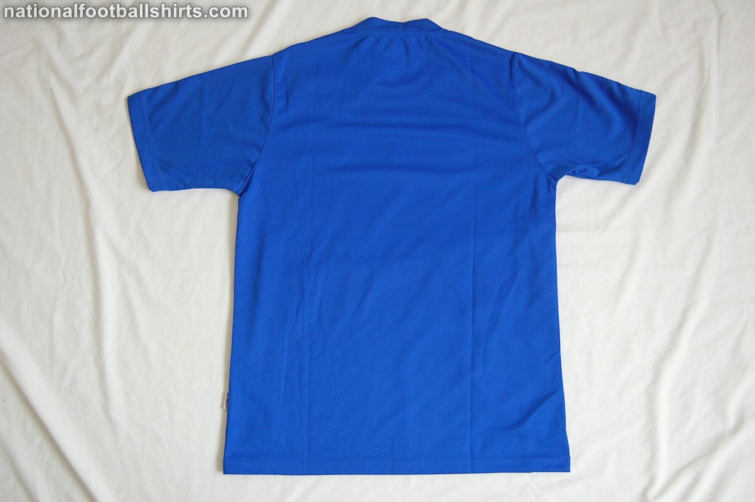
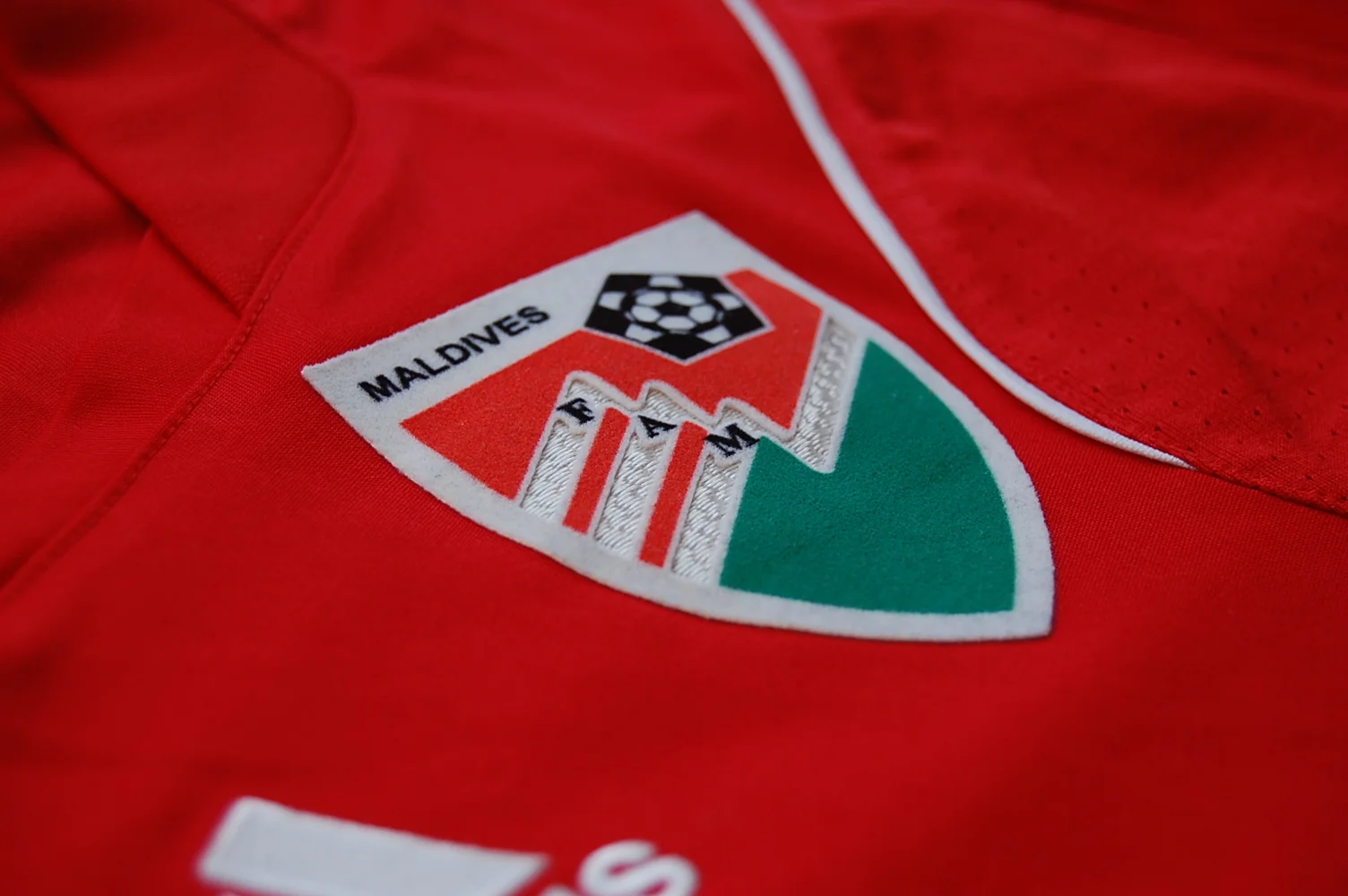
Sri Lanka is one of those nations that has had a free and easy relationship with what can be considered their home colours. In the past few years it appears that their first choice shirts have been on occasion white, amber, yellow and blue. Most recently, they do seem to have settled on a golden shade with maroon, which reflects their flag. The shirt presented here, used during an era of primarily blue home shirts, was first worn at the end of 2012 by the u23 team in the 2012 Mahinda Rajapaksa International Football Tournament (named after the then President of Sri Lanka). Pictures from that competition are scarce, but we do have a picture of members of the four teams and Mr. Rajapaksa himself. We also know for a fact it was worn against the Maldives, who would be the eventual winners of that tournament. At the tournament, Sri Lanka finished third in a four team league, missing out on a place in the final by goal difference to Pakistan. Sri Lanka had also beaten bottom team Bangladesh, and drawn with Pakistan in the round-robin. And while this tournament may not have had much international prestige, have a look at scenes which met the victorious Maldives tram as they returned by boat with the trophy. Another reason to still love international football.
Moving into 2013, the senior team used this shirt in their games during their failed attempt to qualify for the 2014 AFC Challenge Cup. This qualifying campaign, hosted in Laos, was played out over four days in March, with each team playing each other once. Sri Lanka wore this shirt against Afghanistan in a 1-0 loss, and Laos in a 4-2 loss, and finally against Mongolia in a 3-0 win. By later in the year, at September’s SAAF Cup, Sri Lanka would be wearing a new kit.
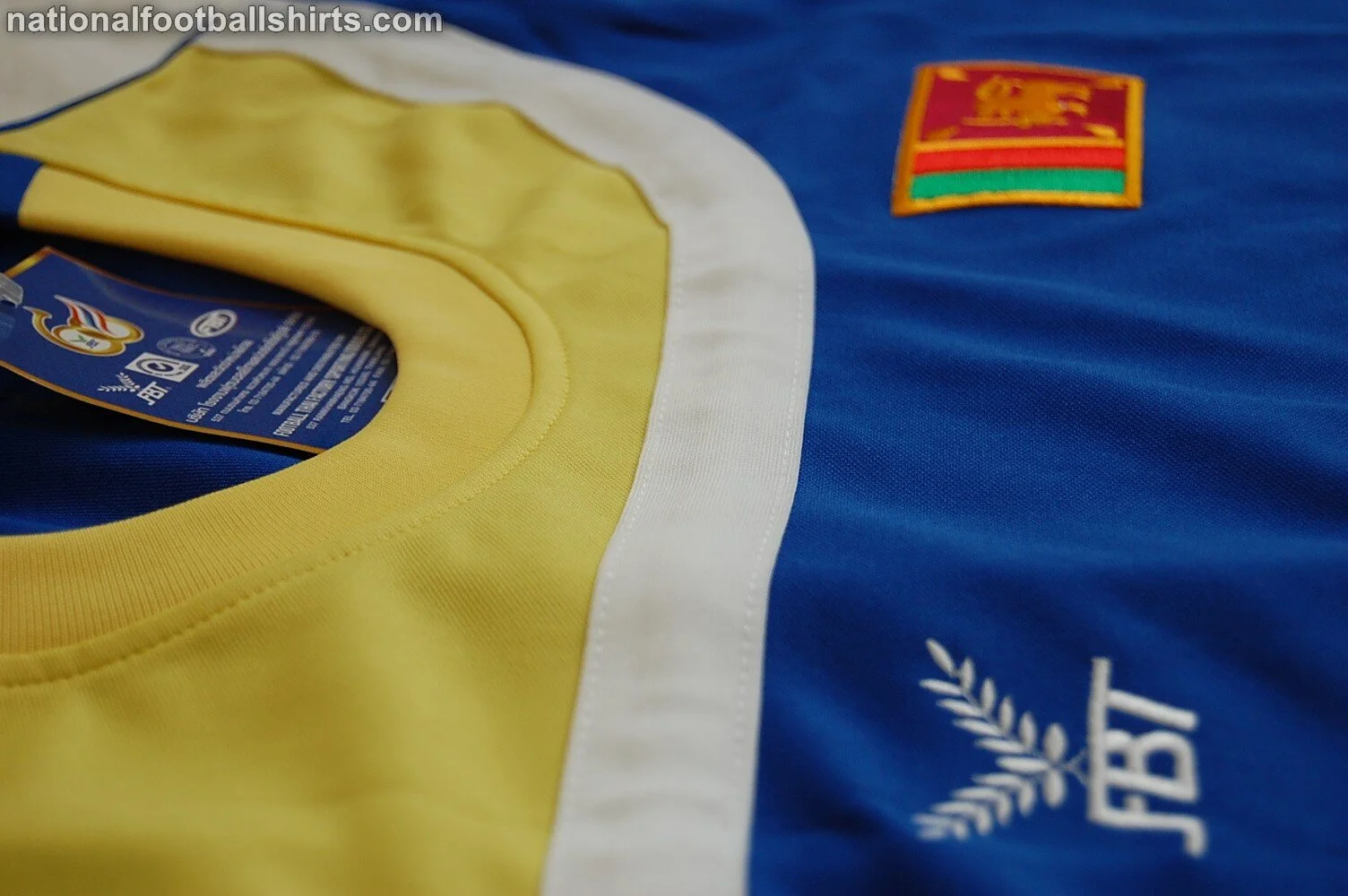
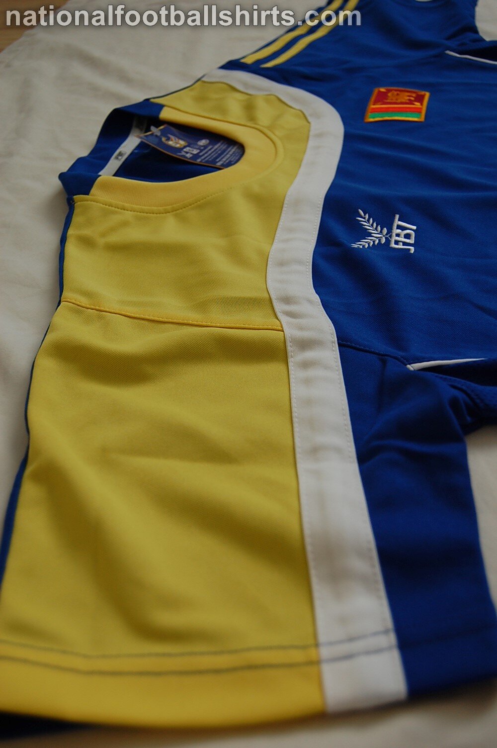
Asymmetric shirt designs can be difficult to execute successfully, but I think FBT produced a great shirt here. The shades of colour are vivid, and the thick white line gives a strong break between the yellow and blue. When I first bought this shirt several years ago, I thought the two yellow stripes on the left sleeve cheapened the look as this is often a trick used by smaller manufacturers to resemble an Adidas shirt. But on looking at the design again for this post, I actually think the yellow stripes are a nice feature in their own right and really help balance the look of the shirt. Without them, the yellow on the front may have looked lop-sided.
